Checkout trust badges and guarantees that do work
A money-back guarantee repeated in 3 places does more for a checkout than a row of security badges. Buyers don't think "this page has a 256-bit SSL badge, I feel safe now." They think "if this goes wrong, what happens to my money?"
My Clepher checkout uses both, and I think the guarantee layering is one of its strongest features.
Why does a repeated guarantee work?
A guarantee only works if the buyer sees it at the moment of doubt, and that moment is different for every buyer. Some hesitate at the top, some at the card fields and some at the very end. So the answer is to show it more than once, in the same words, in the places people look.
Specifics help too. "Unconditional" tells the buyer there are no hoops. "Within 24 hours" tells them the money doesn't take weeks. Compare that with "satisfaction guaranteed," which could mean anything.
What I do on my checkout
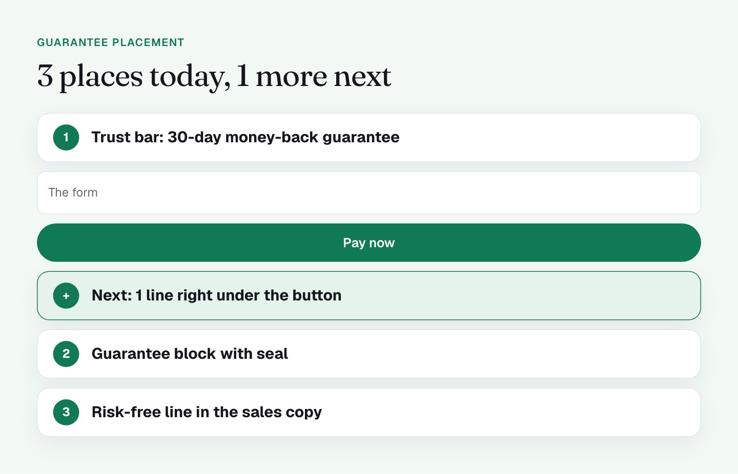
The guarantee shows up in 3 places, and security shows up in its own set.
The trust bar at the top. On every viewport there's a bar above the form with GET INSTANT ACCESS, 30-DAY MONEY-BACK GUARANTEE and 100% SECURE ORDER. On mobile it shortens to "30-DAY GUARANTEE." The buyer sees the promise before they see a single field.
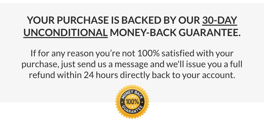
The guarantee block. It reads "YOUR PURCHASE IS BACKED BY OUR 30-DAY UNCONDITIONAL MONEY-BACK GUARANTEE," mentions a refund "within 24 hours" and carries a gold 100% seal.
The sales copy. The right column says "Try it all 100% RISK-FREE," with 30 days of test driving for free.
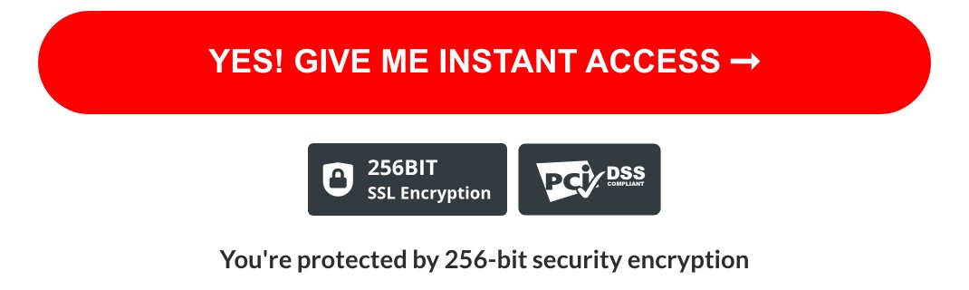
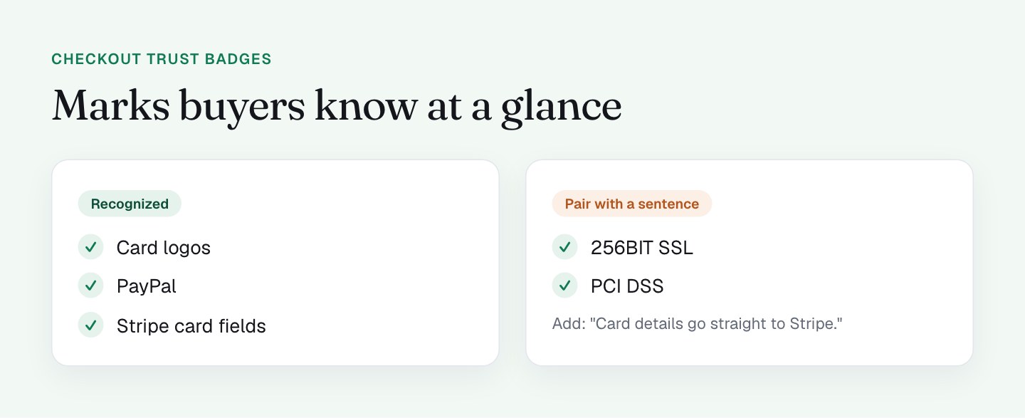
Security marks. Under the pay button there are 2 badges, "256BIT SSL Encryption" and "PCI DSS." The card tile shows the card logos and the PayPal option sits next to it.
Real people to reach. The page shows a phone number, an email link and a chat bubble. I wrote about those in the post on exits and help, and they back the guarantee up: a company that shows how to reach it looks like a company that will answer.
How does "secure" work inside an iframe?
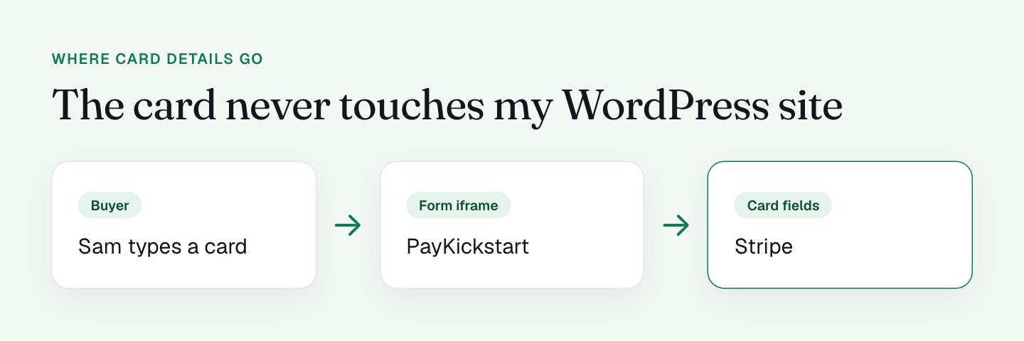
My form is a PayKickstart iframe, and the card fields inside it are a Stripe element in a nested iframe. That's a strong setup, because card data goes to Stripe and not to my WordPress site. The marks buyers already know, such as the Visa and Mastercard logos, the PayPal option and the familiar Stripe card fields, carry that trust across.
What I'll do differently
The foundation is solid. These are the upgrades I'm testing.
I'm adding a 1-line guarantee directly under the pay button. Same words as the trust bar plus the refund time: "30-day money-back guarantee, refund within 24 hours." Right now the guarantee block sits below the iframe, so on a phone it's a different scroll position from the button. I want it in view when the decision happens.
I'm saying where the card details go. A line like "Card details go straight to Stripe. We never see them" explains what the badges can only hint at. I'll test it against the badge row.
I'm testing a leaner badge set. Card logos and PayPal are recognizable, and I'd keep them. For the rest, I want to see whether 1 line of plain text does the same job as extra icons, because buyers can read a sentence faster than they can decode a badge.
I'm making the PayPal logo easier to see. It's recognizable, but it's small and gray on the tile. A bigger version helps buyers who prefer PayPal find it fast. I cover the payment tiles in the post on payment options.
I'm stating what the guarantee covers. With a bump that starts a 30-day trial, I want a line that says how the guarantee applies to it.
Keep it simple
A row of 6 security logos next to the button can look like a page that's worried. I'd choose 1 strong promise and 2 recognizable marks over a wall of badges. I haven't measured badge variations on my own page yet, so I'll test before I claim a result.
What to check on your own checkout
- Where is the guarantee relative to your pay button? If it's more than a short scroll away, add a line beside the button.
- Does your guarantee use specifics (the days, "unconditional," the refund time)?
- Count your badges. Can a normal buyer say what each 1 means?
- Do the guarantee words match everywhere they appear?
- If your form is embedded from another domain, what tells the buyer it's safe? Say it in plain words.
- Does the guarantee cover everything in the cart, including the bump?
FAQ
Where should I put the money-back guarantee on a checkout page?
Put it right next to the pay button, and repeat it near the top of the page. A guarantee only works at the moment of doubt, so I show mine in 3 places and I'm adding a 1-line version directly under the button.
Do trust badges increase checkout conversions?
They can, but only when buyers recognize them. Card logos and PayPal are recognized at a glance, while technical marks like PCI DSS need a plain sentence next to them. I haven't measured badge variations on my own page yet, so I'd test yours.
What should a money-back guarantee say?
It should use specifics: the number of days, whether it's unconditional and how fast the refund arrives. My checkout says "30-DAY UNCONDITIONAL MONEY-BACK GUARANTEE" and a refund "within 24 hours," which is more convincing than "satisfaction guaranteed."
How many trust badges is too many?
I'd keep 1 strong promise and 2 or 3 recognizable marks. A wall of 6 or more security logos next to the button can make a page look worried instead of safe.