Checkout payment options that fit how buyers pay
The best checkout payment options let a buyer pay the way they already pay everywhere else, with as little typing as possible. For most stores that starts with card and PayPal shown up front, and then wallets and local methods on top.
My checkout shows card and PayPal as 2 big, clear choices. Here is why that works, what my test could not verify, and what I'm testing next.
Why do card plus PayPal work as checkout payment options?
Buyers are creatures of habit. Someone who always pays with PayPal does not want to hunt for their card, and someone who does not trust PayPal does not want to be forced into it. Offering both removes that friction before it starts.
The other half is showing the choice clearly. A buyer should see their method in the first second and click it without reading anything.
What I do on my checkout
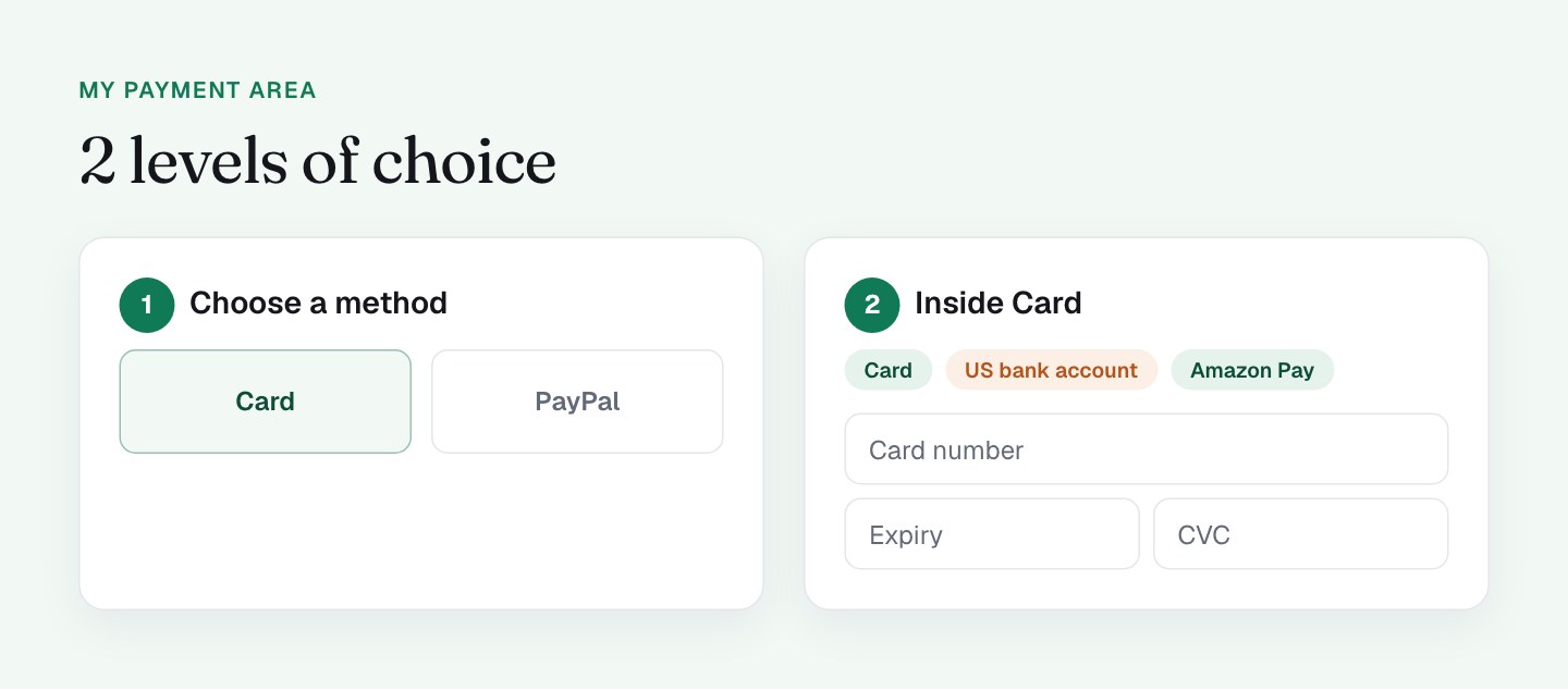
The payment area is built in 2 levels, and the first one is simple and strong.
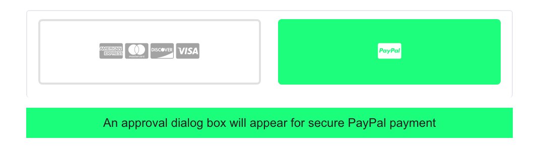
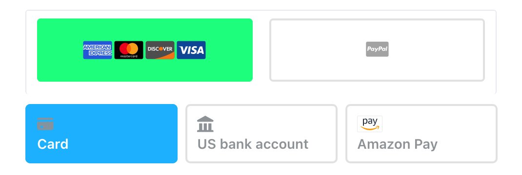
Level 1 is a pair of big tiles from PayKickstart: Card and PayPal. The Card tile turns green when active and shows the card logos, so the buyer knows at a glance what is selected. Choosing PayPal shows a short note that an approval dialog will appear, which prepares the buyer for the pop-up instead of surprising them with it.
Level 2 appears when Card is selected. It is Stripe's payment element, with the card number, expiry, CVC and country, plus Stripe Link ("Save my information for faster checkout"), which lets repeat Link users skip the typing. There are also tabs for US bank account and Amazon Pay.
I like this setup because it puts the 2 big, familiar choices first, and it keeps a fast path for returning customers. It runs on 2 of the best-known payment providers, which also helps buyers trust it.
What the test could not show
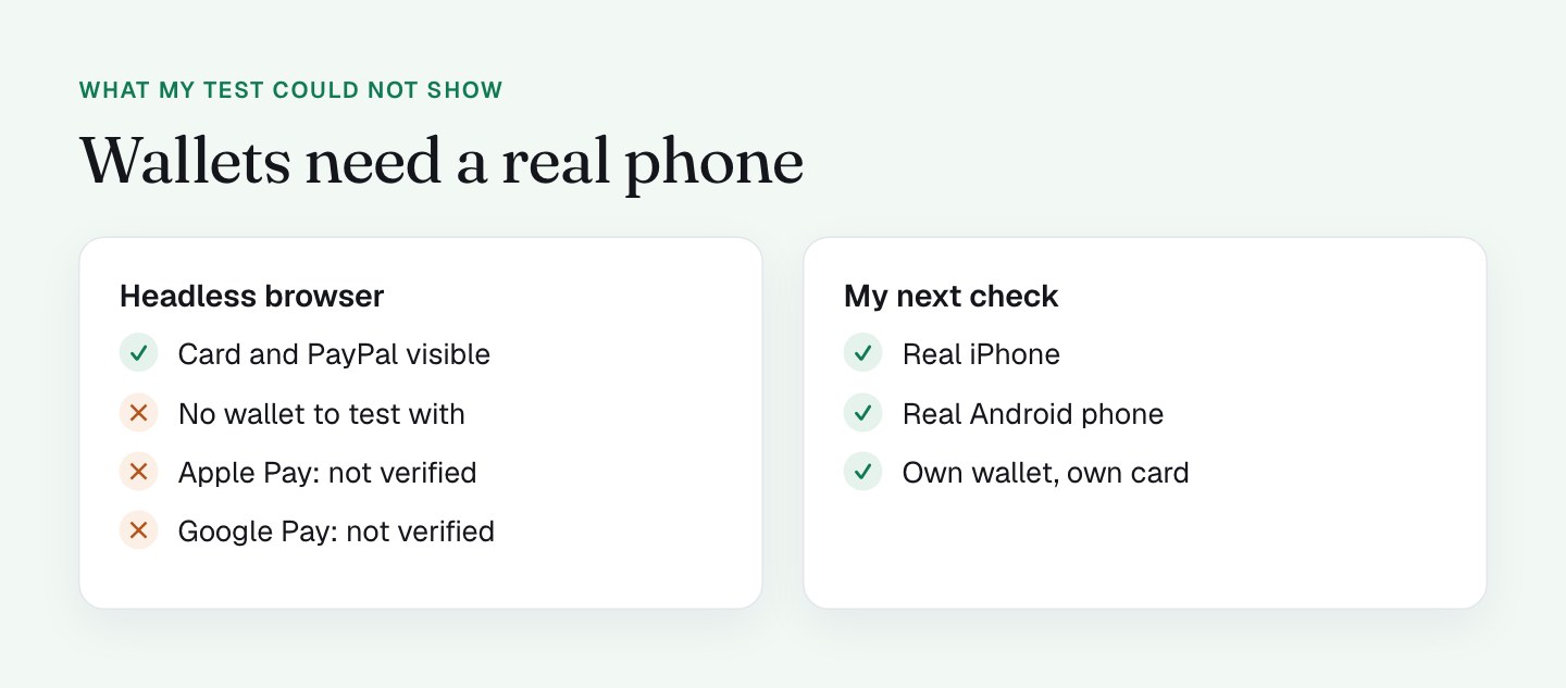
I want to be exact about what I know. I inspected the page with a headless browser, which has no wallet. Google Pay's frames loaded, but no button appeared in that test. Apple Pay could not be tested at all, because it needs Safari and a real wallet.
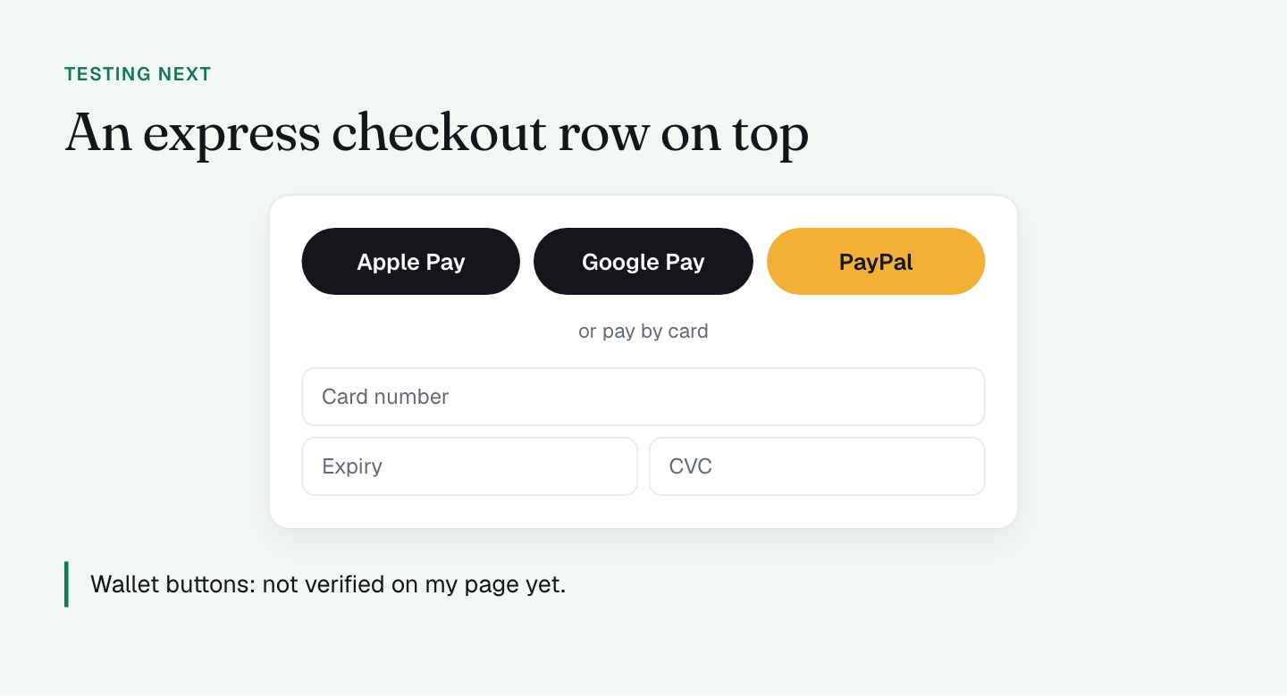
So I have not verified Apple Pay or Google Pay either way. I can only say that no express checkout row showed at the top of the form in the test. Wallets are the one thing most likely to look different on a real phone, so I'm checking them on my own iPhone and Android device before I decide anything.
What I'll do differently
The next version is about getting wallet and local-method buyers to the button faster. Here is what I'm testing.
- An express checkout row at the top. Apple Pay, Google Pay and PayPal as buttons, then "or pay by card", then the fields. A buyer with a wallet is done in 2 taps, and a buyer without one scrolls past. Express checkout is the name for this row of 1-tap buttons.
- 1 level of choice instead of 2. Today the buyer picks Card or PayPal, then, on Card, picks again between Card, US bank account and Amazon Pay. I'm looking at merging that into 1 list, or at least making the 2 levels read as 1.
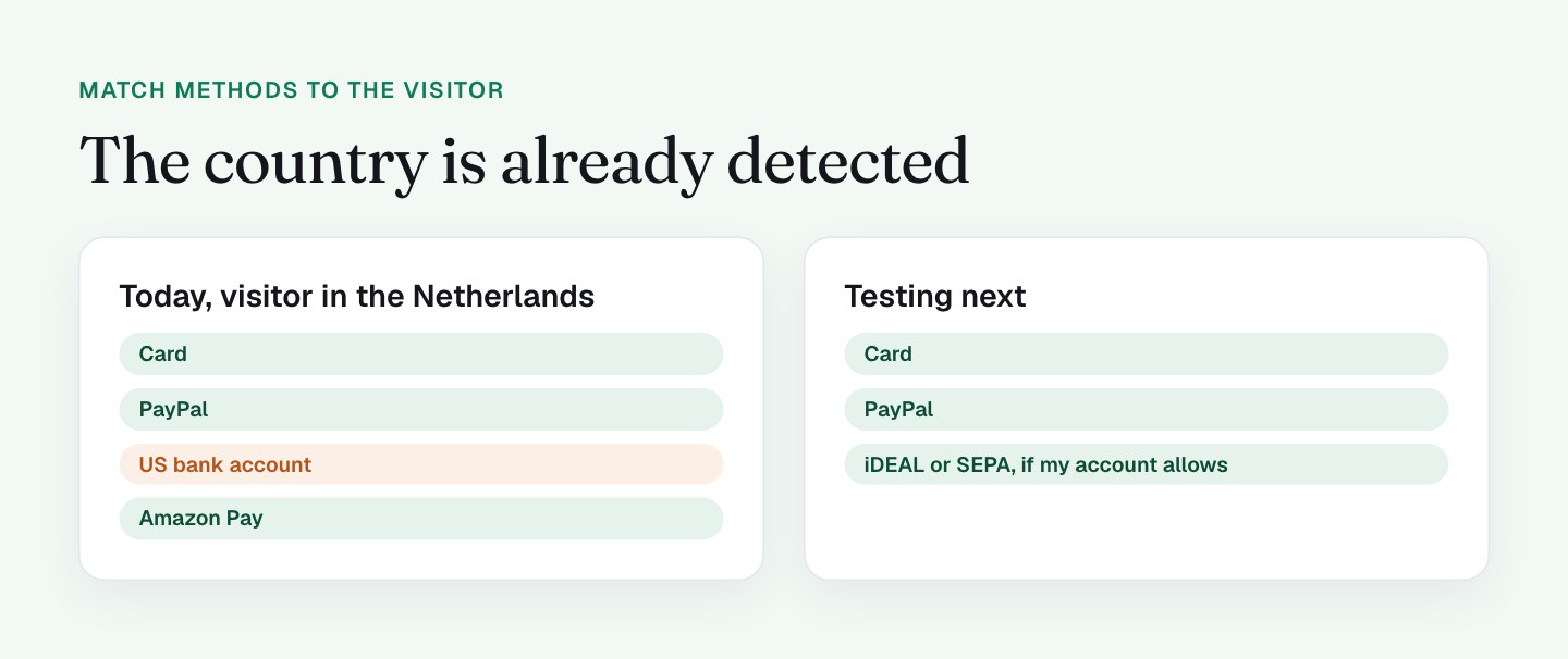
- Methods by country. The page already detects the visitor's country to calculate VAT. "US bank account" is offered to a visitor in the Netherlands, and iDEAL, Bancontact and SEPA were not offered in the test. I'd hide the first for non-US visitors and look at adding local methods for EU visitors, depending on what my payment account supports.
- A bigger PayPal logo. The logo on the tile is small and gray. People who look for PayPal should find it instantly.
- Readable tabs on small screens. On the iPhone-size layout the Amazon Pay tab collapses into a "pay" stub, and on tablet the tabs truncate. I cover that in the mobile checkout design post.
I would not add methods just to add them. Every tab is something to read. The goal is the 2 or 3 methods that cover most of your buyers, shown first and shown clearly. Fewer choices also means fewer fields, which ties back to the checkout form fields post.
What to check on your own checkout
- Open your checkout on a real iPhone and a real Android phone and see whether Apple Pay or Google Pay appears. A desktop or headless test will not tell you.
- Count the choices a buyer makes before typing a single digit.
- Load the page from another country, or ask a friend abroad, and check that the methods make sense there.
- Look at every payment tab at 390 pixels wide. Can you read all of them?
- Check how large and visible your PayPal button or logo really is.
- Ask your payment provider which local methods your account can switch on.
FAQ
Which payment options should a checkout page offer?
A checkout page should offer the methods most of its buyers already use. For many stores that is card and PayPal, plus wallets like Apple Pay and Google Pay, plus 1 or 2 local methods for the countries you sell to.
Should a checkout have an express checkout row?
I think so, and I'm testing it on my own checkout. An express checkout row puts Apple Pay, Google Pay and PayPal buttons above the card fields, so a buyer with a wallet can pay in 2 taps. Check it on a real phone, because wallet buttons often do not show in desktop or headless tests.
Do local payment methods like iDEAL help conversion?
I have no numbers for my own checkout yet. My view is that buyers trust the methods they use at home, so I'm looking at iDEAL or SEPA for EU visitors, depending on what my payment account supports.
Is 2 levels of payment choice too many?
On my checkout the buyer picks Card or PayPal, then picks again inside Card. I think 1 level is cleaner, so I'm testing a merged list or an express row on top.