Price anchoring on a checkout page makes the deal obvious
Price anchoring means showing a bigger number next to your price, so the price reads as a bargain without the buyer doing any math. People do not judge a price alone. They judge it against something, and an anchor gives them that something.
My checkout uses an anchor, and I think it is one of the strongest things on the page. It sits in a checkout that converts at 50 to 60% of the visitors who reach it, so I'm treating it as something to tune, not something to rebuild.
Why does price anchoring work?
A $99 price alone is just a number. A $99 price next to a much bigger one shows what the buyer gets for it. The big number frames the small one as a bargain before the buyer has time to wonder.
The anchor works best when it is believable. A value stack that adds up helps, because the big number then reads as the sum of real things.
What I do on my checkout
The right column has a product mockup with a yellow burst: "$4,589.00" crossed out, then "Today Only $99". Below it are 13 bonuses, each with a value tag, and those tags roughly add up to the $4,589 anchor. So the big number is the total of items the buyer can see.

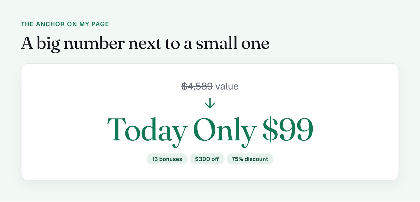
The discount is framed in 3 ways, and each one catches a different buyer:
- "$300 OFF" in the timer pill, which is concrete.
- "75% discount" in the order summary, which is easy to grasp.
- "Today Only $99" on the burst, which shows the price they pay.
VAT is another thing I do well. The order summary shows the product at $399, the VAT at $20.79 (21% for a buyer in the Netherlands), the $300 discount, and the total in red at $119.79. The page detects the country and charges the right rate with no work from the buyer. The bump follows the same honest style: it shows $0.00 today and itemizes the later charge.
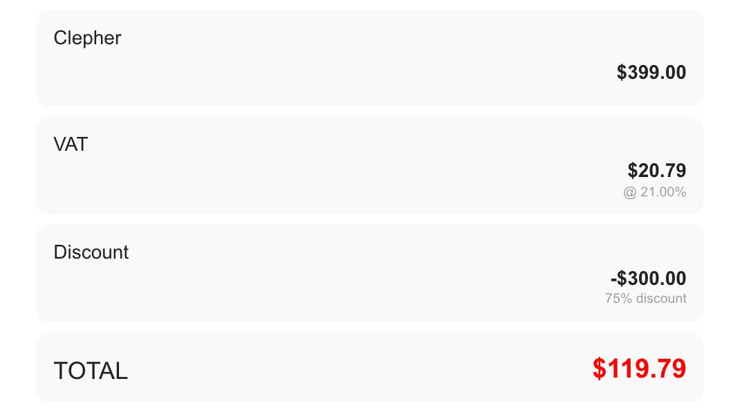
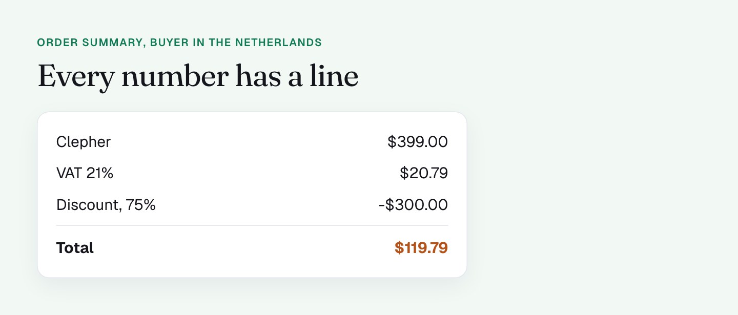
Together, this makes the deal easy to see. The big number is there, the saving is there, and the total is itemized.
What I'll do differently
The next iteration is about making all those numbers agree with each other, so the buyer never has to translate. These are the changes I'm testing.
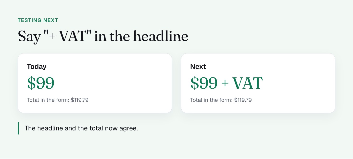
- Showing "+ VAT" where the price is promised. The right column says "Today Only $99", and the red total says $119.79. The difference is VAT and it is correct, but the headline does not say so. Adding "$99 + VAT" in the headline means the total in the summary never comes as a surprise. Buyers in places without VAT see no change.
- Using 1 way to describe the discount in the summary. The "$300 off" line and the "75% discount" label sit right next to each other. I'd keep 1 of them there and test which lands better. In my experience a dollar amount works well on a larger price and a percentage on a smaller one, so I'd test it, not guess. Since the coupon is built into the link, part 11 on the coupon field covers how that discount gets applied.
- Making the summary match the headline. The summary starts at $399 while the burst anchors at $4,589 and sells at $99. I'm looking at a summary that reads as a short story: product, discount, VAT, total, with the same anchor the buyer saw on the page.
- A shorter recap of the value stack on the checkout. The 13 bonuses are persuasion, and they do their job. On the checkout itself, a short recap such as "Clepher plus 13 bonuses" would keep the value in view with less to read. The full stack stays on the sales page.
- Aligning the copy with the bump. The right column says "Clepher + Pro Bonus" and the footer says you're adding a 30-day trial of Pro, while the Pro bump is now unchecked by default. I'm bringing the copy and the default into line, and I get to the bump itself in part 12, on order bumps. The rule is that the page and the form should say the same thing.
The rule I use
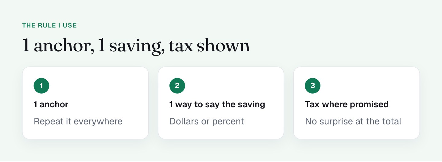
Pick 1 anchor and repeat it. Use 1 way to describe the saving. Show tax where you promise the price. When the headline, the summary and the pay button all agree, the price stops being a question, and the buyer's attention goes where you want it: on the button.
What to check on your own checkout
- List every price and percentage on the page. Count the different numbers.
- Compare the price in your headline with the final total, including tax and fees.
- Decide which 1 number is your anchor, and check that the others support it.
- Use 1 style for the discount, not "off", "percent" and "today only" together.
- Check that the copy about what is included matches what the form delivers by default.
- Load the page from another country to see how VAT or currency shows up.
FAQ
What is price anchoring on a checkout page?
Price anchoring is showing a larger reference number, like a crossed-out value, next to the price the buyer pays. It makes the price feel like a saving. On my checkout, "$4,589" sits next to "Today Only $99".
Should a checkout page show the price with or without VAT?
Show the tax where you promise the price. My checkout calculates VAT by country and lists it in the summary, but the headline does not say "+ VAT". I'm adding "$99 + VAT" so the headline and the total agree.
How many prices should a checkout page show?
As few as possible. Pick 1 anchor, 1 way to describe the discount and 1 final total. My page has 3 anchors and 3 discount framings, so I'm tightening them so the numbers support each other.
Does a value stack belong on the checkout page?
I'd keep the full value stack on the sales page and use a short recap on the checkout. The buyer has already decided, so a line like "Clepher plus 13 bonuses" keeps the value in view with less to read.